
The easiest way to try to make some
sense out of data published in reports may be to make graphs and/or
sort the data to see if there is some recognizable pattern. It is
normal to see almost all statistical reports included graphs to try
to communicate and highlight their notable results. Arranging the
data in a particular theme in ascending or descending order is less
common but some extensive statistical reports like a census report
produce tables of data with some variables of interest sorted by
provinces or some other administrative regions with the region with
highest score at the top and that with lowest score at the bottom.
Graphing from data and sorting data
from data in some electronic format could both be done quite well
with Excel or some other spreadsheet. But only if you know how to get
them into your spreadsheet first. The easiest way to do it would be
when you could download the data in what is called a data file with
“csv” extension. A Comma-Separted-Value
(csv) data file can be
opened with a spreadsheet directly and then saved as an Excel file or
other spreadsheet file if you wish. Now smarter people will use what
is known as an “api” or application programming interface
provided by the data provider to get data from the Internet.
For me playing with published data
should be as natural as children playing with sand on the beach. Here
in Myanmar it used to be that not all data of public interest
collected from people were published, or if published they were
not always publicly available. In one instance, I was even told by a
government official that I couldn't cite data from their published
report. It was fifteen years ago, though, and I was officially
collecting some indicators for the ASEAN Secretariat. If knowledge is
power, it certainly wasn't people's power, I thought. Hopefully
everything has changed now as exemplified by the offer of DHS
microdata to researchers when the results came out recently.
For generating data of public interest,
Demographic and Health Survey (DHS) usually supported by USAID and
Multiple Indicators Cluster Survey (MICS) supported by UNICEF are the
two most popular surveys in the developing countries. We Myanmars
have seen a series of MICS being carried out in our country but the
DHS Myanmar 2015-16 is the first DHS for us and its report is
available here.
The good news is that you could
register and request the microdata for this DHS apart from macro data
and information available freely through the reports and the hosted
database.
Quickly going over the DHS report, I
noticed what seemed to be a somewhat strange shape of the population
pyramid. I visually compared it with the population pyramid of the
Myanmar Population Census 2014 report.

It seems like the age range 15-29 in
DHS is pinched appreciably. So I tried putting the two pyramids on
the same graph as shown below.

Why this difference? We know that a
large number from the working age population has gone out to work in
neighboring countries and elsewhere, and therefore it seems like the
reduced proportion of 15-34 age range in males and 15-29 in females
may be explained by this fact. However, we note that the populations
graphed by both the DHS and Census were enumerated on the same
defacto basis. So it seems like the population 15-34 has been
genuinely under represented in the DHS. However, I am not smart
enough to understand if that would have significant impact on the the
survey results or not. Surely real statisticians could make it
understandable to the ordinary folks.
Anyway, my real intention is to share a
few dumb techniques I picked up to extract data from postscript or
pdf files to csv files and make them into graphs after
reading them into a spreadsheet. The particular type of graph we are
going to make is a population pyramid which many of the users of
Excel or other spreadsheets may not be familiar and find it hard to
do.
My target audience is the fellow
dummies in Myanmar. More widely the general public. Here in Myanmar
most still use pirated software, I guess. But, pardon me, I have been
using freeware or opensource software for quite a long time. And I
strongly encourage others to do so. Why should we be enslaved? Still?
First we'll extract data from a
document in pdf format. Normally we open such document with
Adobe Reader which comes free. If you want to extract a picture of a
data table in that document to put it in your report, you could
easily use the “Take a snapshot” tool. But there is no way you
could cut a table and then paste it somewhere using the Adobe Reader.
To do so I used the Tabula software available for free here.
To manipulate and graph the extracted csv data you need a
spreadsheet and I recommend Open Office Calc spreadsheet which is a
component of the Open Office software available here.
Open Office is a dependable alternative to the Microsoft Office
software and it is completely free.
The materials used will come from the
DHS report available here
and the Myanmar Population Census report available here.
I created the graph of population
pyramid from DHS report superimposed on the population pyramid from
the Population Census report that is shown above with the following
steps:
Step-1:
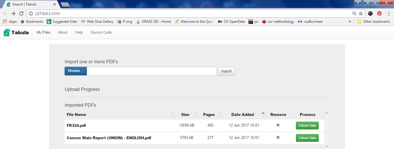
Run the Tabula software by double clicking its shortcut.
I assume that you
have installed the Tabula software and know how to create the
shortcut on the desktop of your PC. Now Tabula will be opened and
waits for you to specify the pdf files to import. Note that I've
specified the names of the two above files and clicked the Import
button in the following screenshot.
Now you click the
green button to extract data. Here you scroll down to page-52 in the
DHS report where the Table 2.7 for
population pyramid data is and select the data to be extracted (area
shown in pink).

Then click the green button and you get the data preview.

Is the data OK? No! The first column puts “Age” and “Male”
together. Well, read the hints given in the text on the left-most
side of the Tabula screen and try to adjust the selection so that you
get the preview right.

Then
saved the data as csv
by clicking the Export
button.
Step-2:
Manipulate data in spreadsheet.
Now
I opened the resulting csv
file with Open Office Calc:

Similarly I exported the Table A-6a giving the population by
five-year age groups and sex from the Census report to csv format and
opened with Open Office Calc. Collecting the two data sets in a
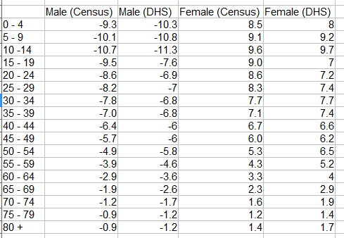
spreadsheet and after the extraction of columns and some arithmetic,
I get the following table that has all the information needed to
create my population pyramid:
Step-3: Graph it.
The above table shows percentages of males and females of different
age groups in their own groups. Notice that males are shown as
negative percentages. This is because we need to use a bar chart to
draw a population pyramid with males on the left of the X-axis.
Another trick is to align the bars for males(left) and females(right)
in the same age group perfectly level. You do this by overlapping
bars by 100%.

The final trick is to show percentage labels -15, -10, -5 without
the minus signs by changing the number format of the Y-axis.

After adding the title and adjusting colors, lines, font, legend and
so on, you should get the final graph:
